作者: omaskzhbw2162@gmx.com

  • Portrait Vs. Landscape Orientation: Which is Best?

    Portrait Vs. Landscape Orientation: Which is Best?

    The choice between portrait (vertical) and landscape (horizontal) orientation profoundly impacts visual storytelling. By understanding their distinct strengths, photographers can transform random decisions into purposeful compositions. Below is a technical breakdown of optimal applications and workflow strategies.

    1. Subject vs. Background

    Choosing between a portrait or landscape orientation is often based on whether the photographer wants to SHOW MORE OF THE SUBJECT or MORE OF THE BACKGROUND in their image.

    For example, in the photo below, the photographer chose a landscape orientation where the frame is wider than it is tall.  This means that filling the frame with this wide subject will cover most of the frame with only a little background showing above or below the subject.

    Landscape Portrait

    On the other hand, if you shoot the same subject with a portrait orientation, there will be a significant amount of background showing above and/or below the frame.

    Portrait and Landscape

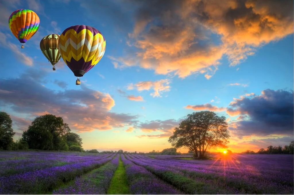
    A similar but opposite effect happens when the subject is taller than it is wide.  If you photograph it with landscape orientation, there will be a large amount of background on one side (or both) compared to how much of the frame is taken up by the subject.

    Portrait Landscape

    Instead, if you use a portrait orientation, you can fill the frame nicely with a tall subject.

    Portrait Orientation

    Of course, we are talking about aspect ratio in relation to subject size “in a general sense” because by using different focal lengths or physically moving closer or further away from the subject; you can include more or less of the subject and background in the frame regardless of the orientation.

    Suppose you shoot a photo in landscape or portrait and later decide that you want to use the opposite orientation; it may be possible to do this using the crop tool in Lightroom or Photoshop or alternatively by extending the background in Photoshop.

    I say it “may be possible” to crop an image to a different orientation because you will need to ensure there is enough space around the subject to allow for a good crop.

    The best way to do this is to compose your shot in-camera and then physically take a step back OR reduce your focal length to include a bit more of the scene in your shot.  This will give you significantly more options when cropping in Lightroom or Photoshop.

    2. What Message Are You Trying to Convey?

    What message or story do you want your image to convey?  This is another important factor you should use when choosing between a portrait or landscape orientation for a particular shot because when you change the orientation, you are also changing the composition – and with it, you’re also changing your image’s message.

    In the previous section, we discussed how the vertical or horizontal format affects how much of the frame is taken up by your subject.  This decision has more implications than just aesthetics.

    Let’s look at a practical example by analyzing these environmental portraits of a sculptor in his studio.

    In the landscape-oriented image below, the photo captures much of the studio space, finished sculptures, tools, and the piece the sculptor is working on right now.  All of these things provide the viewers with a great deal of context.

    Landscape and Portrait

    Alternatively, in this portrait-oriented photo, we see the sculptor much closer.  This image allows us to better appreciate his facial expression as he is thinking about how to proceed with his work which is also partially in the frame.  In this case, the portrait framing is ideal for capturing a more intimate and psychological portrait.

    Landscape or Portrait

    Let’s look at another example:

    In the vertical photo below, the photographer emphasizes the trees’ height and the path’s depth.  The path looks endless, and it feels like you’re on the outside, about to go into the woods.

    Landscape vs Portrait Orientation

    Alternatively, the landscape orientation of the photo below makes everything feel closer.  As viewers, we feel immersed in the woods, surrounded by all the trees.  And the path, if anything, would be a way out, not drawing us in.

    Landscape V Portrait

    3. Output Format

    I once heard fine art photographer, Brooke Shade, say during a course that you should ask yourself, “Where do you want your images to live?”

    She meant it in a broader sense, but this question can also help determine whether you should shoot a particular image in portrait or landscape orientation. 

    Your choice can depend on the intended use of the photo.  Let me explain:

    Think about a magazine – if you want your photograph to be on the cover, you need to shoot it with a portrait orientation.

    What Does Portrait Orientation Mean

    Instead, if you want your image featured on a double-page spread, you will need to shoot it in landscape orientation.

    Landscape Versus Portrait

    Output format doesn’t just relate to print, either.  Websites and social media also have various formats. 

    Let’s say you want to use your image on Facebook – if you want to use it as a cover photo, then it needs to be landscape oriented, but if you want to use it for your Stories, then it needs to be portrait oriented.

    4. Style

    As you can see, many TECHNICAL FACTORS can and should inform your choice between portrait and landscape, but it ultimately has to do with YOUR STYLE because anything can be photographed both ways.

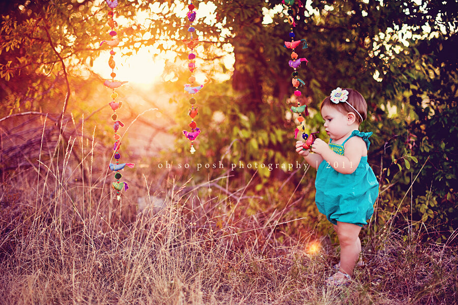
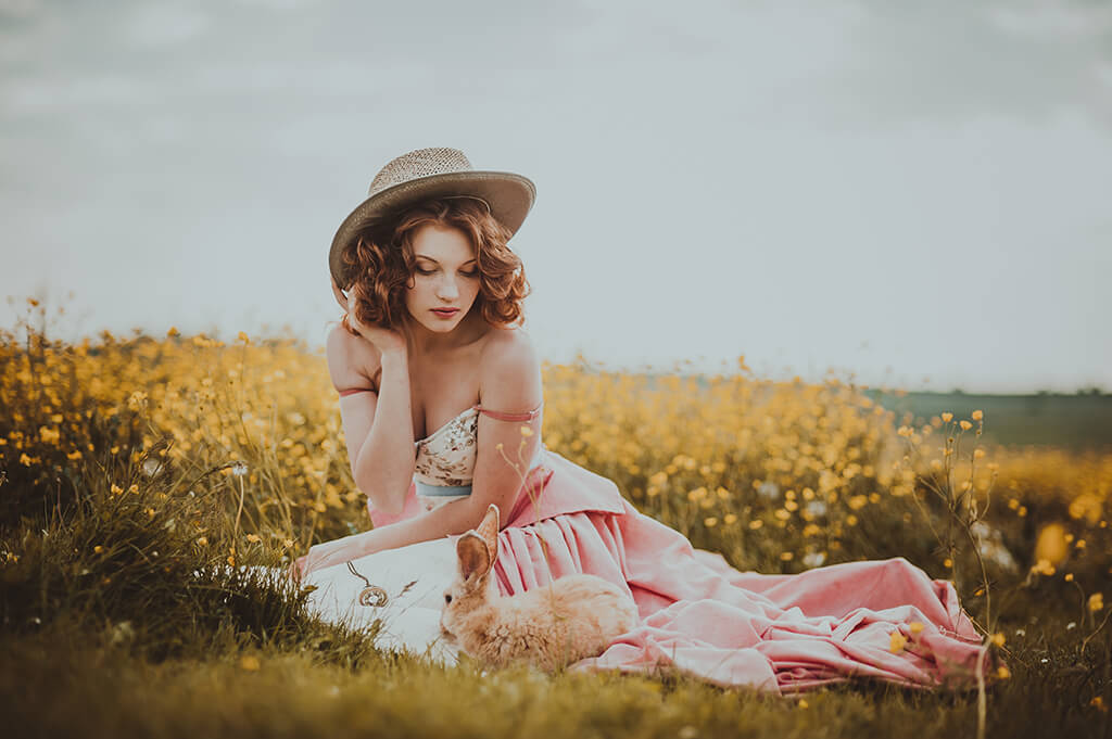
    In these portraits, you can see how the author includes different elements in the scene to give us different perspectives.

    In this landscape-oriented photo, we feel closer to the subject as there isn’t anything in front of her in the foreground.  The photographer also uses leading lines as a composition technique to draw our eyes to the subject.

    Difference Between Portrait and Landscape

    Alternatively, in the portrait-oriented photo, the photographer uses a frame-within-the-frame composition which feels more constrained and separates us from the subject.

    Portrait Vs. Landscape Orientation
  • Top 5 Tips for Beautiful Fall Photos

    Top 5 Tips for Beautiful Fall Photos

    Here’s a professional English rewrite of your text, enriched with actionable insights from the search results to maximize impact for photographers aiming to elevate their fall photography business:

    Capturing Autumn Magic: Essential Fall Photography Tips for Success

    As a photographer, early fall holds an unmatched allure—golden light, vibrant foliage, and the perfect backdrop for family sessions and mini-shoots. To help you make the most of this fleeting seasonal window, here are proven strategies to enhance your autumn photography workflow and client satisfaction.

    1. Take Advantage of the Fall Colors

    Fall is the perfect time of year to shoot outdoors.  When the leaves are in full color, just before they fall off the trees, they offer a gorgeous backdrop for any type of photography. 

    To boost the contrast and Fall colors, even more, try attaching a polarizing filter to your lens.  Polarizing filters will subtly increase the contrast of your image in-camera and save you from having to add contrast in post-processing.

    Fall Photographer

    2. Wear the Right Clothes

    If you are photographing individual or family portraits, suggest that your clients wear solid colors.  If they insist on patterned clothing, make sure the pattern is very basic.  There is already so much color in nature during Autumn that it can make heavily patterned clothing appear extremely busy against the backdrop of bright Fall colors.

    Also, pay attention to the color of the leaves versus the color of your subject’s clothes.  Try to get your client to dress in colors that are complementary to red, yellow, and orange.  These include shades of blue and green; of course, the classic black, white, and gray combo is always a winner! 

    For more information, check out our What-to-Wear to a Photoshoot Guide for Families here.

    Autumn Photography

    3. Lighting

    In the fall, you may deal with sunny or completely cloudy days.  Here are some tips for shooting in both situations!

    For sunny days, try shooting when the light is soft – either in the morning or early evening.  Shooting at Golden hour is ideal.  This time of day will decrease the harsh shadows on your subject and illuminate the leaves on the trees, creating a stained-glass effect with all the colors.  Click here for more information on taking photos in the harsh mid-day sun.

    If the sky is cloudy, you may find that the scenery looks a bit gloomy.  Don’t fret, though! 

    A tiny pop of flash will increase the contrast and saturation of the colors of the leaves and illuminate your subject.  Don’t overdo the flash – a little bit goes a long way.  The goal is to avoid creating shadows with your flash, so you will, most likely, need to set your flash close to its lowest setting or use a flash diffuser.  Here is an excellent cheat sheet for lighting.

    Photography Autumn

    4. Camera Settings

    Fall is the perfect time to take advantage of shooting with a wide aperture to create some dreamy, blurry background bokeh that will make viewers swoon!  A wide aperture (for example, between f/2.8 and f/4.5) will blur the leaves while maintaining perfect focus on your subject. 

    On the other hand, you can try experimenting with a narrow aperture (f/8 and higher) to get more of the leaves in focus.  This can result in some interesting shots, but you MAY find the increased focus on the leaves makes the various colors too busy and takes the focus away from your subject.

    Photography Fall Pictures

    5. Post-Processing

    Depending on where you live (and many other factors, including weather, lighting, etc.), you may find your images need additional post-processing to achieve a beautiful Fall look.  Or you may just want to enhance the warm red & orange leaves that can only be found for a short time every year.

    You can certainly play with the many Lightroom sliders to enhance various Fall colors.  However, my absolute favorite way to edit Fall photos is with the Warm & Organic Millennium Preset Collection (for both Lightroom desktop & mobile) and the Bold & Vibrant Lightroom Adjustment Brushes (Lightroom desktop only).

    These beautiful presets & brushes will quickly transform and infuse your images with warm, vibrant colors, golden hues, and rich color enhancements that are perfect for a Fall look.  Often these enhancements are completed in one click, but as with all presets, sometimes you may need to make some minor adjustments to exposure and white balance settings in Lightroom, depending on your camera and shooting conditions.

    As you can see from all the BEFORE and AFTER photos in this blog post, the Warm & Organic Millennium Preset Collection does an incredible job of enhancing and unifying the various tones and colors that occur naturally during the Fall.

    Photography in Fall
  • 8 Easy Tips for Dreamy Backlit Photography

    8 Easy Tips for Dreamy Backlit Photography

    Mastering Backlit Photography: My Proven Workflow for Capturing Warm, Ethereal Imagery Through years of refining my approach to backlight photography, I’ve developed a signature method that combines technical precision with artistic intuition. Here’s my step-by-step guide to creating luminous, warmth-rich backlit images, tested across diverse shooting conditions.

    1. Best Time to Shoot

    Since backlight photography requires that the sun and the light are on the back of your subject, you will have to shoot very early in the morning, right after the sun rises, OR late in the evening, right before the sun sets. 

    The evening is a very common time for photographers to shoot because of the beautiful golden light available and why it’s often referred to as the Golden Hour.  Typically the hour right after the sun rises and the hour right before the sun sets are the best times to achieve the most beautiful backlighting possible.

    Backlit Photography

    2. Use Spot Metering

    When shooting with backlighting, setting your camera on Spot Metering is important. 

    That way, the camera will read the light from your subject’s face to get the correct exposure rather than the overall light in the background.

    3. Where is Your Source of Light?

    A big misconception about backlighting is that you only have to pay attention to the light behind your subject. 

    Even though that is very important, you also have to be aware of the light in front of your subject to get lovely skin tones and catchlights.  If you are in an area with many trees behind you, you will find it very disappointing that even though the background looks beautiful, your subject’s face can be very dark.

    To avoid this, you will need to look for areas of open shade.  By that, I mean an area BEHIND YOUR SUBJECT with some trees in the back to block some of the sun but still let some sun peek through the leaves, and an area BEHIND YOU where there are no trees, just a wide open field so the beautiful light from the sky can reflect on your subject’s face.

    If you can’t find any areas of open shade, you will have to start using a reflector.  You will also need an extra pair of hands for that, so bring an assistant.  When photographing children, they typically move around so fast that I usually choose not to use a reflector but rather go hunting to find the right spot for my photo session.

    Portrait Backlighting

    4. Shade is OK

    Don’t be afraid to place your subject in the shade for backlit photos, but make sure it’s open shade.  Look for the spot where the shade meets the bright light from the sun, position your subject in the shade, and watch for their hair for that soft sunkissed glow.  Perfect!

    Don’t worry if your in-camera pictures don’t look like they have enough sun.  That’s where a good Lightroom Preset or Photoshop Actions and Overlays will come to the rescue! 

    If you can get just the softest touch of sun-kissed glow on your subject’s hair, run some of the magical actions or presets I have linked to above, and you will be amazed how the sun can be intensified in post-production. 

    5. Exposure

    As I mentioned, you want to ensure your camera is set on Spot Metering, and you will have to set your exposure based on the light on your subject’s face.  Yes, the background may be slightly blown out, but we don’t have to worry about that.  Our focus should be on the subject, and that’s all we have to worry about.

    Backlighting Photography

    6. Camera Settings

    What camera setting should you use for backlight photos?  Like anything in photography, the answer is – IT DEPENDS.  It depends on what type of feeling you are trying to achieve in your image. 

    Do you want your pictures to tell a story

    Then you should set your aperture to the highest value number f/22, f/16, f/11 (very small aperture opening) so that the whole scene is in focus.

    Do you want to isolate the subject from your background

    Then you will need to set your aperture to a very low number f/1.4, f/1.6, f/1.8, f/2.0, f/2.8 (very wide aperture opening). 

    Here are some great blog articles to help you understand how to get the correct exposure and understand the relationship between ApertureShutter Speed, and ISO – or collectively referred to as The Exposure Triangle.

    Backlit Photo

    7. Eliminate Flare

    Unless you want to be very creative and love flare in your pictures, you will have to ensure that no flare is falling on your subject’s face or skin when you are taking photos.  Again you can take a few creative shots, but most people love seeing crisp, clear eyes and don’t like the faded images produced when the sun comes full force into your lens.

    To eliminate this, you need to position your subject right in front of a tree or any other object that breaks the sun flare from the sun.  Backlit photography doesn’t mean that the sun has to be directly behind the subject, so don’t be afraid to move to the right or left until the sun is just to the side and does not come full force into your lens. 

    lens hood or even your hand is another great way to eliminate or reduce sun flare in backlit situations.

    If you are just starting out, try practicing these techniques with a doll and a chair.

    Backlit Portrait

    8. Practice a Lot!

    Last but not least – PRACTICE, PRACTICE, PRACTICE.

    Backlit photography is not something you can learn by reading.  Practice makes perfect.  Each season – SpringSummerFall, & Winter you will see that even if you use the same field for your photo sessions, you will have to be creative and watch how the sun is moving in the sky and make the necessary changes where you position your subject according to the sun, for good backlighting.

  • How to Adjust Masks Using the Amount Slider in Lightroom

    How to Adjust Masks Using the Amount Slider in Lightroom

    Lightroom Mask Opacity Control: Enhanced Mask Amount Slider Adobe Lightroom 11 introduces the long-anticipated Mask Amount Slider, a precision tool that revolutionizes localized adjustments by enabling users to dynamically control mask opacity and effect intensity. This feature streamlines workflows previously hindered by manual multi-slider adjustments.

    What is the Masking Amount Slider?

    The Amount Slider that is now available with the masking tools in Lightroom gives you the ability to adjust the amount of a mask you have applied or a mask preset you have used. 

    It saves time by allowing users to adjust the amount of a mask with one straightforward slider rather than having to change multiple sliders you may have used to create the mask.

    Where to Find the Masking Amount Slider?

    The Masking Amount slider is located at the top of the “Effect” portion of the masking controls.  The Amount slider will appear as soon as you move some sliders or choose a brush preset (Lightroom Classic).  It will remain grayed out until you apply the changes to your image.

    Masking Amount Slider

    How to Adjust the Masking Amount Slider?

    Once changes have been made to your image, you will then have the ability to adjust the Amount slider to add more or less of the effect to your image:

    • To add MORE of the effect, drag the slider to the right (numbers greater than 100).
    • To add LESS of the effect, drag the slider to the left (numbers less than 100).

    It’s as simple as that!

    Lightroom Amount Slider

    Where Else Can You Find the Amount Slider?

    Lightroom has also added the Amount Slider to the Presets Panel, so you will now see an Amount Slider for your presets in the Develop Module in Lightroom Classic and anywhere you add presets in Lightroom and Lightroom Mobile.

    However, the Masking Amount Slider is only available in Lightroom Classic and Adobe Camera RAW (ACR).  This is excellent news if you use Photoshop’s ACR to make your batch changes.

    Amount Slider Lightroom
  • ID Card Mockup

    ID Card Mockup

    Free Customizable ID Card Mockup from PhotoshopSupply Download this professional ID card mockup from PhotoshopSupply to create personalized designs for employee badges, student IDs, event passes, and more. The PSD file is fully layered and optimized for effortless editing in Photoshop or online editors like MockoFun.

    ID Card PSD [FREE Download ]

    Download for free this horizontal ID card template. The ID card mockup is fully customizable. All the elements are in separate layers and they are well grouped.

    Use the smart objects to customize the ID card design.

    • Inside the name tag PSD file you have a smart object called “YOUR DESIGN INSIDE”.
    • To edit the ID card design, double click on the thumbnail to open the smart object.
    • Edit the ID card design. Don’t forget to add your ID card photo to personalize the identity card mockup.
    • Then, save and close the smart object to see the result.

    This is an ID mockup PSD free. So, click on the download button below to get the identity card template.

    Name Tag Mockup

    This identity card mockup has a ID card design included. But, inside the mockup you can add any identity card design that you want.

    With this free id card template you can create all kinds of cards:

    • Employee ID card
    • Student ID card
    • Visitor ID card
    • Child ID card
    • Teacher ID card
    • Doctor ID card, etc.

    ID Card Photoshop File [PSD]

    This is free name tag mockup is an ID card Photoshop file. So, it only works with Photoshop. If you don’t have Photoshop, you can create ID cards online with MockoFun.

    Create any company ID card design you wish. The ID badge mockup has two versions (see details inside).

    For customization, you can edit the colors of the company id card template quite easily. Make a visitor badge template in under 5 minutes. The size of the ID badge mockup file is 4500×3000 px (72 dpi).

    Create your own personalized ID badge template or company name tag using our free mockup file.

  • How to Add Border in Photoshop

    How to Add Border in Photoshop

    Free Photoshop Frame Actions & Border Implementation Guide

    Elevate your photo editing workflow with these free Photoshop frame actions for creating decorative borders. Compatible with Photoshop CS4-2025 and various design scenarios.

    How to Add Border in Photoshop

    To create border in Photoshop is quite an easy process. You can use many methods to add border to image in Photoshop. I will show you the easiest way to add photo frame to your photo.

    Add Border to Image
    Add Border to Image in Photoshop

    Add border to photo in Photoshop, in just a few easy steps:

    1. Open your image in Photoshop.
    2. Double click on the image and add a Stroke layer style.
    3. Input the Size of the border, set the Position Inside and also choose the Color of the Photoshop border.
    4. Add also an Inner Glow layer style.
    5. First set the Choke to 100%. Set the Size greater than the size of the Stroke layer style.

    As you can see, it’s quite easy to add frames in Photoshop.

    But, you will have to make some repetitive steps each time you want to add border in Photoshop. And, if you have a lot of photos to process, this will take you a while.

    Photoshop Border Around Image [FREE Action]

    To help you add Photoshop borders and frames to your pictures quick and easy, I made this Photoshop frame action. You can download the frame Photoshop action for free.

    In the preview you can see all the Photoshop frames and borders that you can create with this free action.

    All the frames are editable, so you can change the size and the color of the border. You can add a simple Photoshop black border or two borders in Photoshop. The action includes 10 actions for adding frames in Photoshop.

    How to Use Photoshop Actions

    To use Photoshop actions, first you have to load the action and then to play the action.

    1. Load the Action in Photoshop

    • Go to Window > Actions and click on the top right corner button from the Actions tab.
    • Click on Load Actions to load the action

    2. Play the Action in Photoshop

    • Open your photo in a new document. (Note: for using the PhotoshopSupply actions, double click on the photo locked background to turn it into a regular layer)
    • Click on the action you would like to run.
    • Go to the bottom menu of the Actions tab.
    • Click the Play button and wait for the action to complete.
    Photoshop Border
    How to Add Border in Photoshop

    With this action you can frame photos easily and add simple borders. Framed posters also look great on your wall.

  • Banner Fonts

    Banner Fonts

    Free Banner Font Collection & Design Guide Download these professional banner fonts optimized for Photoshop, Word, and online editors like MockoFun. Ideal for creating ribbon-like text effects and decorative headers.

    If you are looking for free fonts similar to this banner font, try my Ribbon Font which is also available online in MockoFun.

    The banner font has special characters that you can use to add decorative ribbons. So, if you type < >, [ ], { }, ( ), = + you get these cute ribbons.

    Banner Fonts

    To create different effects combine the 3 font layers, add stroke outline, increase letter spacing, etc.

    The banner font has three versions that you can combine to make colored fonts. These types of fonts are called layered fonts.

    Layered Fonts

    Layered fonts consist of multiple font files that are designed to be used together to create a font design. So, the layered fonts include multiple files for each layer.

    Layered fonts or multi layer fonts are designed to create letters with different shades or colors.

    Banner Fonts

    Each layered font is designed for a certain text effect. When you use different colors for each font layer, you can create letters that appear raised, 3D letters, shadow fonts, etc.

    In this case, you can use each font individually or you can mix them. If you need fonts for birthday banner, try this one. Use a curved text add add a line above the text to make a cute happy birthday banner font.

    Online Text Editor [FREE]

    As a Photoshop alternative, try MockoFun to make text design online in just a few minutes. This decorative font is available for free in MockoFun text editor. So, try it there for free!

    In the image below I used the outline font version of the banner font to make coloring pages. The outline fonts or hollow fonts are the best fonts for coloring.

    The banner fonts look great on birthday cards, especially if you choose a curved text. Use them as happy birthday fonts, especially for kids.

    Banner Font
  • Heart Font

    Heart Font

    Download these free overlay template PNG images to elevate your streaming channel’s visual appeal. Perfect for Twitch, YouTube, and other platforms, these resources include versatile designs for facecams, panels, and transitions.

    Other free fonts that you might like!

    The heart font style is cute and playful. Use the heart with letters inside for birthday cards, children posters, coloring books and so on. There are other free heart fonts but this is quite unique & lovely.

    The heart font has special characters that you can use to add decorative letters. So, if you type < >, [ ], { }, ( ), / \ you get these cute hearts. All the capital letters are made using the same doodle hearts.

    ❤ Heart Letters & Heart Alphabet

    I hope you will enjoy using these heart shaped alphabet letters in your projects. If you need a heart text symbol to copy paste, check out this list.

    Other heart fonts that I found online like the cursive heart font, the heart letters font or the font with hearts for dots have also a beautiful design. My love font is inspired by the love heart sweets font. I added some cute elements to turn it into a doodle font.

    Heart Font
  • Stream Overlay Template No Text

    Stream Overlay Template No Text

    Free Stream Overlay Templates & Implementation Guide

    Download these free overlay template PNG images to elevate your streaming channel’s visual appeal. Perfect for Twitch, YouTube, and other platforms, these resources include versatile designs for facecams, panels, and transitions.

    As you can see in the image below, a stream overlay is a graphic frame or border around your webcam . It can be used for your stream starting soon, offline message, for Twitch stream overlays and webcam overlays.

    Free Stream Overlay

    In this pack you will find 18 stream overlay PNG images with transparent background. Our OBS overlay images don’t have text. To make your own custom Twitch overlay, add text and other elements using a graphic design software.

    Why Every Pro Streamer Needs an Overlay

    You might wonder why to use a streaming overlay for your channel?

    Streaming overlay images like Twitch overlays for example, make your channel unique. A live stream overlay also provides a more enjoyable and memorable viewing experience.

    Some streamers choose a simple stream overlay so that people to focus more on the content. To make their channel really unique and cool, others search for a cute stream overlay or an animated stream overlay.

    Stream Overlay Template No Text

    If you are looking for free twitch overlays, get our stream frame PNG images.

    So, the pack includes 18 Twitch stream overlays (stream overlay template no text). Use them to make your own gaming overlay in just a few minutes. Our webcam frames are so easy to customize.

    The Twitch overlay size is 1920 x 1080 pixels. You get a stream overlay PNG file with transparency. The stream overlay template has the same design with different color combinations.
    If you want to add your own personal touch, search for other elements like streaming backgrounds, stream Logos, stream icons, etc.

    Download the stream overlay template free! You don’t really need a complicated twitch overlay maker, simply use this gaming overlay template png in OBS.

    Free Stream Overlays

    You can also check out this free stream overlay template with editable text that you can change online. You don’t need graphic design skills to use this stream border maker free. Find the best font for streamlabs from a list of 800 online fonts. To add text overlay on live video stream choose a font that you like from the streaming fonts list.

  • Bubble Graffiti Font

    Bubble Graffiti Font

    Download these handpicked graffiti bubble fonts for Photoshop, Word, and other editors. Perfect for posters, T-shirt designs, and editorial projects. Includes free online generators for instant customization.

    Other free fonts that you might like!

    This graffiti bubble letters font is actually a layered font made from two fonts that you can combine to create colored fonts.

    If you wonder how to draw graffiti bubble letters, you have to know that it’s quite a complicated process to do this from scratch. So, many people use graffiti letters or graffiti fonts because they are so easy to use.

    Bubble Graffiti Font

    If you don’t have Photoshop, check out this graffiti bubble letters generator that you can use online. Or, use this item to create a cool graffiti name in just a few minutes. Both of these items are actually made with my street urban font. So, if you are looking for an online graffiti alphabet generator, this is it!

    Make graffiti alphabet letters, use different colors, add text styles, gradients and even textures. Here you can find some of the best free textures including graffiti textures.

    Graffiti Font Free Download

    Our bubble graffiti font also contains graffiti font numbers and some punctuation marks like ?, !, &, etc. To make a graffiti outline font, I usually add a stroke outline.

    If you add other layer style you can create really awesome graffiti letters design. I like to add other elements like drips, splashes, stains and other graffiti graphics. Make your own free graffiti letters in PNG format. There are plenty of graffiti font ideas to inspire you.

    You can use the street graffiti letters that you make for commercial projects but you have to give us credit with a link back to our website.

    Bubble Graffiti Font

    Below you have a preview image of the graffiti fonts alphabet. The graffiti art font contains only capital letters, numbers and punctuation. Many urban street fonts only contain uppercase letters.

    There are plenty of different graffiti fonts and graffiti writing styles. For those of you that don’t know much about graffiti writing, I have gathered some useful information.

    Street Font Styles

    My set contains graffiti bubble letters, but there are lots of other graffiti text styles. In the image below you have the main graffiti font styles that you can use for your projects.

    • Tag graffiti letters. Tag is the most basic and the most prevalent form of graffiti. … Tag is a stylized personal signature and contains graffiti writer’s name, also known as a moniker. Tagging is the easiest and simplest style of graffiti; it includes one colour.
    • Throw up graffiti letters. A throw-up is like a more complicated tag. It usually has two or more colours, and bubble-style lettering. A throw-up can be done quickly and repeatedly, just like a tag. Throw ups emphasized the flow between the different letters layering them on top of one another.
    • Blockbuster graffiti letters. Blockbuster style stands for large murals made of sprayed letters that are done quickly. The goal of blockbuster graffiti is to cover a large space in a short amount of time by taking letters and spacing them evenly apart from one another and adding the 3 dimensional aspect to the letters.
    • Wildstyle graffiti letters. Wildstyle is a complicated and intricate form of graffiti. Due to its complexity, it is often very hard to read by people who are not familiar with it. Usually, this form of graffiti incorporates interwoven and overlapping letters and shapes. Because of that it is considered an advanced style of writing and can take years of dedication to master. source: graffiti styles
    Graffiti Styles Fonts

    As you can see, there are so many graffiti lettering styles. Each has its own characteristics and style. Some of the best graffiti fonts are in fact inspired by the hand drawing graffiti letters made by street artists.

    ❤ Write Graffiti Online

    As a Photoshop alternative, use this graffiti generator tool online. You can even draw graffiti online using graffiti vector elements from their gallery. For example, create a cool graffiti text or an eye catching name graffiti quick & easy!

    This is one of the best graffiti letters maker that you can use online. No need to install any software on your computer. This is a free graffiti font generator that has lots of free fonts and alphabet letters.

    Graffiti Font