Unlock premium presentation quality with our free professional envelope mockup template – featuring fully-editable layered PSD files (up to 4000×3000px resolution) . Instant customization through smart objects allows seamless logo integration and foil printing effects , while modular layer groups enable granular control over envelope flaps, strings, and metallic accents .
If you are looking for an envelope PSD template with a baronial style, try it! The envelope PSD free is made by our graphic design team.
Our envelope mockup is editable in Photoshop, Photopea or any other graphic design tool that can open PSD files.
There are lots of types of envelops, each with its unique design.
We have the modern A-style envelopes, one of the most common being the A4 envelope. Baronial envelops are deeper and have a large pointed flap. They are popular for invitations, greeting cards, announcements and are also often referred to as greeting card envelopes or invitation envelopes.. An envelope with a similar design is the banker envelope that is used mainly for business purposes.
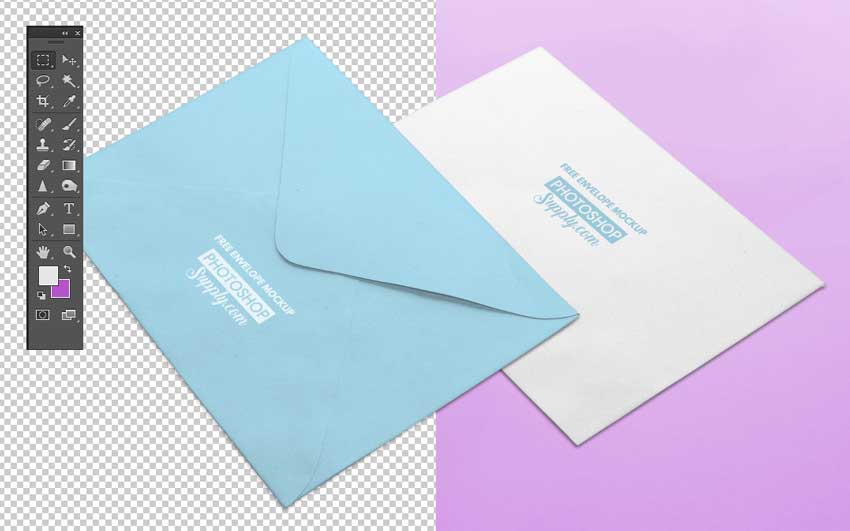
Envelope PSD Template
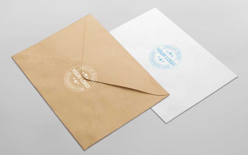
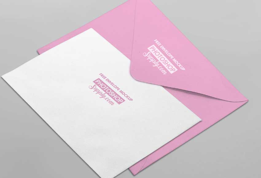
The PSD file includes two envelope mockups. Each has color adjustments. You can choose the classic cardboard paper style, the white color paper or you can set the color of your choice.
Below you have the envelope design mockup with a stamp logo. Note that the stamp logo is not included but you can add your own logo, text, shape, etc.
If you like our envelope mockup free, add it to your freebie collection.
Below you have the invitation envelope mockup PSD free download. The square envelope mockup download will give you the layered PSD inside a ZIP file.
How to Use the Envelope PSD
Inside the PSD file you have two groups. Inside you have the envelope design and the smart object with the logo. Open the smart object and place your logo inside to see the result.
To move the logo, use the Move Logo layers not the Group because it has a mask. If you want to move the envelope, move the entire Group.
The RAW file format, often misunderstood by new photographers, is a powerful tool that transforms your workflow from restrictive to liberating. Let’s dismantle the myths, clarify its benefits, and simplify the process of shooting and editing RAW files.
What is a RAW Image File?
You know that film photography uses negatives, right? All of the information recorded by the camera is on the piece of film in the camera at the time the photo was made.
In the same way the image information is contained in the negative in film photography, in digital photography, the image information is contained within the RAW file – it is a file that includes all that the camera’s sensor “saw” when the image was made, with minimal compression or file manipulation. Just like all the image information is contained in the negative in film photography, in digital photography, all of the image information is contained within the RAW file.
In comparison, the JPEG files that your camera defaults to are highly compressed files, and because of this compression, they lose some of their original file information.
But what is compression?
Compression simply refers to the amount of data contained in a file such as a JPEG or PNG. A JPEG is a highly compressed or “lossy” file format. It does not include the same amount of information as a RAW file, which is considered a “lossless” format.
We’ll talk more about what information is compressed below, but for now, simply know that a RAW image file contains MORE INFORMATION than the standard JPEG.
And more information equals more freedom in your post-processing.
Remember, a RAW image file is not truly an image yet – it Is digital information that needs to be converted to a viewable image format. Just like a negative in film photography, the RAW image file is not yet a usable image – it has to be manipulated to create a (traditionally) usable image.
So, instead of having film negatives made into prints to see our images, we are converting a file to a format we can look at on our computers, share online, and/or print.
You may wonder why you can see an image preview on your camera’s LCD screen after you take a photo if the RAW file is not viewable.
The answer is this: when shooting in RAW, the image on your camera’s LCD screen is a JPEG preview of the RAW image. So, instead of showing you the RAW file (again, you can’t actually view the RAW file itself), your camera is taking “certain information” from the RAW file and converting it to a JPEG preview that reflects what was recorded in the RAW image file.
RAW Vs. JPEG: What’s the Difference?
A JPEG image is an image file that can be viewed across devices without the need to be converted to a viewable file format, whereas a RAW file is not yet a universally viewable image file. A RAW file is an electronic bundle of information that needs to be converted to a format such as a JPEG, TIFF, DNG, etc., in order to view and edit it in Photoshop or Lightroom.
After being converted to a DNG (short for “Digital Negative”) and imported to Adobe Camera Raw or Lightroom, images shot in RAW appear to have less contrast and are typically not as sharp as a JPEG. They also appear less saturated. All of this is EASILY adjusted in post-processing.
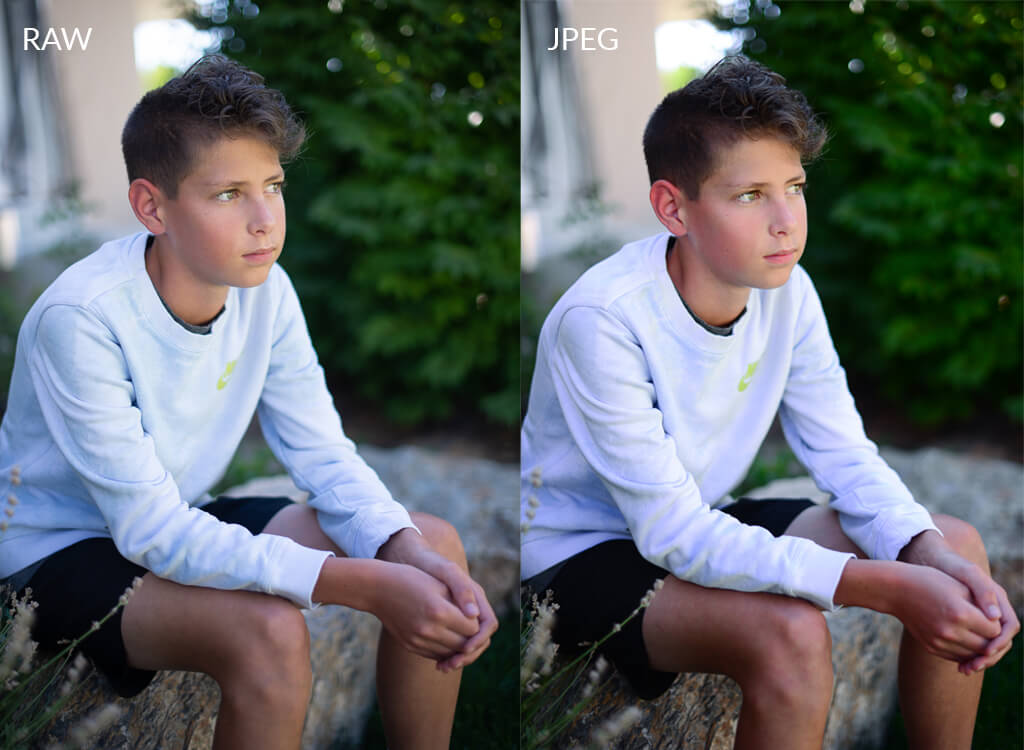
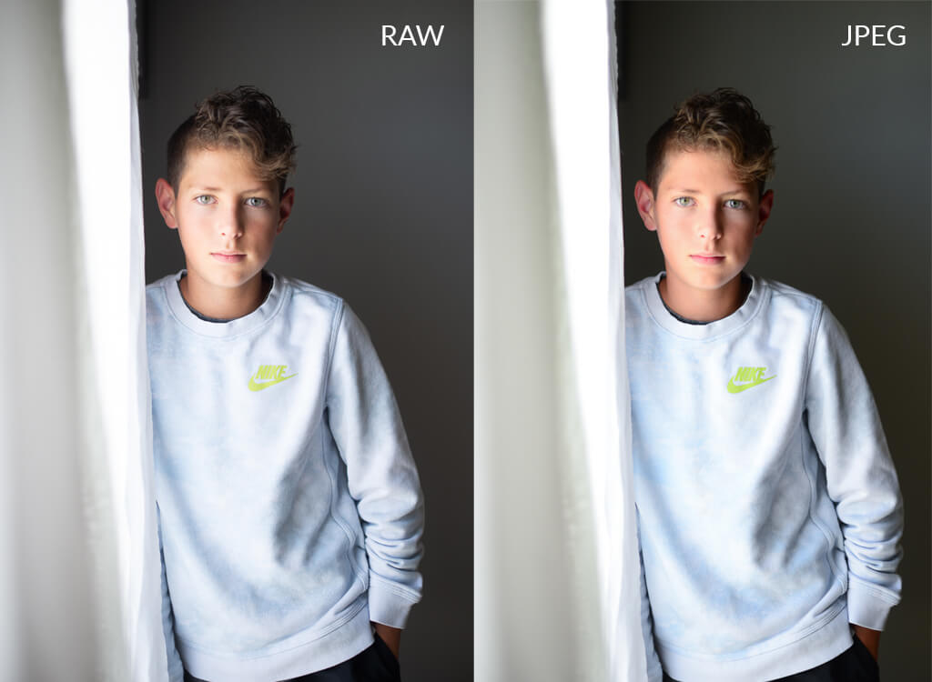
Here is a comparison of a RAW file and a JPEG, both untouched, straight out of the camera:
As you can see, the RAW image has less contrast, clarity, and saturation than the JPEG. This is because the RAW file is not compressed – it is precisely what the camera’s sensor “saw,” whereas the JPEG is a highly compressed version of the RAW image.
Your camera’s software discards certain information in order to compress a file while simultaneously editing the image in-camera to look the way the camera “thinks” it should look. Therefore the compressed JPEG will look slightly different than the RAW file.
There is a common misconception that a RAW file requires much more editing than JPEG.
While RAW does require one or two more steps in your workflow than JPEG, those steps are minimal and not time-consuming. We will get to that in the next section, but the “extra” editing required for a RAW image takes only seconds to perform. And with presets in Lightroom and Adobe Camera RAW, your RAW images may only need one click to adjust contrast, clarity, and saturation.
Since RAW files are not compressed, they are MUCH LARGER than JPEGs and take up more space on your camera’s memory card. So you will need a LARGER memory card to shoot in RAW.
Advantages of RAW over JPEG
So far, we have mainly been comparing the basic differences between RAW and JPEG, so now let’s now discuss some of the benefits of RAW over JPEG:
1. Dynamic Range
First, and arguably the most important advantage (as previously mentioned), RAW files give you much more control in editing than a JPEG ever will. Since RAW gives you a wider dynamic range, the values ranging from whitest white (highlights) to solid black (shadows), you will have more freedom to adjust exposure without running into pixelation.
For example, if you have an underexposed RAW image, you can increase the exposure much more than you can with a JPEG. A JPEG will give you pixelation and digital noise in the shadows much sooner than a RAW image.
2. Color
Do you ever find that the color in your photos seems “off” from what you saw with your eyes? While replicating exactly what we see with our eyes is nearly impossible, you can come VERY close when shooting in RAW.
RAW image files can contain anywhere from 4096 – 16384 different colors, whereas a standard, compressed JPEG can only have 256. This also gives you more room to tweak the color of a RAW image in post-processing.
3. White Balance
Since a RAW file gives you more freedom with color and dynamic range, correcting the white balance of a RAW file is much easier, fine-tuned, and will give you more natural results than correcting the white balance of a JPEG file.
How to Set Up Your Camera to Shoot RAW
First, you need to set your camera to shoot in RAW, which is done through your camera’s menu. Your camera defaults to shooting in JPEG, so you will need to change your settings when you want to shoot in RAW (or switch back to JPEG). The images below show where to change the file type on a Canon 5d Mark ii and a Nikon D90.
Setting Up Nikon to Shoot RAW:
On the Nikon, press the Menu button, navigate to Image Quality, and select NEF (RAW). As you will see below, you can choose to also shoot in RAW + JPEG. When you are new to shooting in RAW, you may want to shoot in both formats until you are confident enough to shoot in RAW alone.
You will also see RAW + JPEG Fine, Normal and Basic, which are varying levels of compressed JPEGs, with Fine being the highest quality (and also the largest of the JPEG file sizes) and Basic being the lowest (and smallest size).
Keep in mind that shooting RAW + JPEG will take up A LOT of space on your memory card, so making a choice early on to shoot in just RAW will save you a lot of space.
Setting Up Canon to Shoot RAW:
Setting up your camera to shoot in RAW on a Canon is similar to Nikon, except the RAW + JPEG option will have L, M, and S for JPEG, which stands for Large, Medium, and Small JPEG files – similar to Fine, Normal and Basic on the Nikon. To shoot only in RAW, make sure that the red box is around RAW and that the straight line is selected in JPEG:
If you still have questions about how to set your camera to shoot in RAW, or if you have a camera model that was not covered here, please refer to your camera’s manual.
How to Shoot in RAW
Next, all you need to do is shoot as you normally would, taking every measure to get your in-camera shot as perfect as possible. The fact that you are shooting in RAW should not affect how you shoot in any way.
Even though RAW gives you much more leeway in your editing, you will still need to strive to get your shot correct in camera. A common misconception about shooting in RAW is that you can use Auto White Balance, and everything will come out great. While this is true – you can use Auto White Balance and easily adjust any incorrect tones in post – getting your white balance right in-camera will save you a step in your editing workflow.
Here is an example of a RAW file shot with the white balance set to Auto and Daylight:
The Auto White Balance image is not too bad, but it is more on the blue side than what the flower and table actually look like. With the white balance set to Daylight, the image looks much more accurate to what the setup looked like in real life. Again, post-processing can quickly fix this, but I encourage you to save yourself a step and get it right in-camera!
The main thing that will change for you when shooting in RAW instead of JPEG is that you will need more storage for your RAW files on your camera’s memory card than you would for JPEG files. So, if you are shooting with an 8GB memory card and have a wedding to shoot, you will definitely want a larger memory card, and you should probably purchase more than one.
Once you have finished your shoot and it’s time to edit, you will need to import the RAW images into a program on your computer that will convert the image from RAW to a file you can edit, such as DNG. DNG stands for “Digital Negative,” playing off the idea of a film negative. This is Adobe’s standard RAW conversion format.
Importing and Editing Raw Files
In Photoshop, when you open the files, Adobe Camera Raw (ACR) will appear. At this point, you can make adjustments to your image. If you use actions and brushes or textures/overlays, follow the prompts to open the image in Photoshop once you have completed your basic adjustments.
After you have imported the files into your editing program of choice, you will see that the images on your screen look different than they did on your camera’s LCD screen. Do not panic; this is how it works, and it’s totally normal!
Remember our straight-out-of-the-camera RAW and JPEG comparison earlier? That is exactly what you are seeing here. With Lightroom in particular, when the image is imported, it will suddenly look different. This is because Lightroom is switching from showing you the JPEG preview to the original RAW file. This may sound a bit confusing, but you will know exactly what I mean once you see it happen in Lightroom.
When you have finished editing, you can then export/save it as a TIFF, PSD, JPEG, etc., depending on your client’s or your printer’s needs. At this point, if you export as a JPEG, you won’t lose the edit that you made to the RAW image – in other words, your exported/saved image will look like your final edit, NOT the photo that you originally imported.
Most photographers who shoot in RAW prefer to save/export as a DNG for their records. You may find that your printer requires a JPEG or a TIFF, but for your own records, exporting/saving as a DNG will take up less storage space on your computer than a file such as a TIFF or a RAW file, but it’s still considered a relatively lossless file format.
When Shouldn’t You Shoot in RAW?
This is a hot question and always up for debate. I understand the arguments for why you should always shoot in RAW, and I also know why some photographers choose to shoot in JPEG. I really do believe that it comes down to personal preference on this issue, though, so I am not going to tell you that there are times when you shouldn’t shoot in RAW, nor am I going to tell you that you should always shoot in RAW – that is up to you and what you feel is best for your situation.
Let me give you an example of a situation where you may NOT want to shoot in RAW:
During an impromptu shoot with friends and their children, you only have an 8 GB memory card with you. Since you weren’t planning on doing much shooting, you aren’t as prepared as you would normally be before a regular, planned shoot with a client.
This is a situation where you could either shoot in RAW and have around 150 images to work with, or you could shoot in JPEG fine (the highest quality JPEG setting) and get around 500 shots.
Anyone with kids knows that erring on the side of 500 shots will give you way better odds than 150! Also, if you have good light and know how to get things right in camera, you probably won’t need much editing, so the RAW format is not as important here.
In short, because a) you are in a pinch and only have an 8 GB and b) you have great light where you can nail your shots in-camera, you may want to choose to shoot in JPEG over RAW.
So, with that example in mind, know that there will be SOME SITUATIONS where it will be more practical and more beneficial for you to shoot in JPEG.
Strategic File Renaming in Lightroom: 3 Methods for Efficient Workflows
critical organizational task, and understanding the optimal use cases for each method streamlines catalog management. Below is a technical breakdown of the three primary approaches, their advantages, and ideal scenarios.
Method 1. Renaming on Import
To rename your photos when importing, go to the File Renaming Tab on the right-hand side of the Import dialog box.
I import all my photos via Lightroom, and I rename all my files on import to get rid of the letters my camera places at the beginning of each filename – DSC (Nikon) or IMG (Canon). These just bug me, and I don’t want to see them.
This is the type of renaming you want to do on import – a process you will want to do for EVERY photo you import.
Follow these steps to create your own preset that renames your photos:
Check the “Rename Files” box in the File Renaming panel. From the Template drop-down menu, you can choose one of those options. If needed, new options will open up in the File Renaming Panel to help you. If you want to make a custom option, choose “Edit” at the bottom of the drop-down menu.
If you want to make a custom option or preset, choose “Edit” at the bottom of the drop-down menu selected above. A new box will open up. Delete all the text in the white box. Then choose the options that will give you the result you are looking for. Each drop-down menu below the large white box has several options for you to choose from. When you find the one you like, press “Insert.”
To save these settings as a preset, go to the top drop-down menu and choose “Save Current Settings as New Preset.” Give your preset a name and click “Create.”
Method 2. Renaming Files After Selecting Favorites
I like to use this type of renaming for client photos. I typically don’t love the long sequence of numbers that most of my files are left with after they have been taken. So once I have chosen my favorites, I select and rename them.
To do this, you need to be in the Library module. Then, select the photos you want to rename and hit the “F2” key or choose Rename Photos from the Library drop-down menu. (go here for my other favorite Lightroom keyboard shortcuts
This will open a dialog box that will give you several options for renaming your files. “Custom Name-Sequence” is the one that I choose most often. Using this method, I can add the client’s name (custom name) and start the numbering of these favorites at #1 (sequence).
I choose this renaming method (over the next one I will tell you about) because I want the files that I give my client to have the exact same name on my hard drive. Otherwise, things can get very confusing, especially if you try to look up a photo to edit later on.
Method 3. Renaming on Export
You can also rename on export from Lightroom. This is another way that I rename photos, but I DO NOT use it frequently for Client photos for the reason I just mentioned in the previous paragraph.
I DO sometimes use this renaming technique on files I am printing (to differentiate them from other files) or posting to my blog or social media (to have keywords in my photo title).
To rename on export:
First, select the files that you want to export.
Right-click and choose “Export” or press “CTRL + Shift + E” (PC users) or “CMD + Shift + E” (Mac users).
Then scroll down the section that gives you the options for file renaming.
Click the box next to “Rename to:” and choose the options you want as your photos are exporting.
Once you click “Export,” they will also be renamed.
Mastering Clipping Masks in Photoshop: Essential Techniques for Precision Editing Clipping masks are fundamental tools in Photoshop that enable non-destructive, layer-specific adjustments while maintaining creative flexibility. By linking two layers, they allow you to control visibility based on the shape or transparency of the base layer. Here’s a comprehensive guide to leveraging clipping masks effectively.
Step 1. Open New Document
Start by opening a new document in Photoshop. This will be your background – so you can use a solid color, a gradient, or an image.
Step 2. Add Text
Enable the Text tool and type your message in the document. I recommend keeping it short, maybe one or two words.
Make sure the font size and type are wide enough to show a good amount of the image – otherwise, the effect may not be very noticeable. For this example, I used a font called Impact.
Step 3. Add an Image that You Want Inside the Text
Next, we will open and add the image that will be inside the text. You can do this by going to the menu and selecting File>Place Embedded. This will take you to a dialog box where you can choose the image you want to show within your text.
You can also just open an image and use the move tool to drag it into the document with the text.
Step 4. Add Clipping Mask
Once the image is added to the document, we will add a clipping mask so that it ONLY shows within the text. To do this, you can use any of the methods described above. Again, I prefer using the keyboard shortcut “Ctrl + Alt + G” (PC users) or “Cmd + Opt + G” (Mac users).
Step 5. Reposition the Image as Needed
Grab the Move tool and reposition the image within the text to your liking. You can also use the transform tool if desired – none of this will affect the text.
Note: Since all the layers are independent, you can go back and change the background color, text size, font, position, etc., to get the final result you are happy with!
Example 2. Using Clipping Masks to Make Adjustments to a Single Layer
Step 1. Open Document
Start by opening your composited document. The document can have any number of layers, with one or more layers that need adjustments. To keep it simple, I will use a photo that needs a sky overlay added. This will require two basic layers – a subject layer and a sky layer. I can then fine-tune those layers with additional adjustment layers.
Step 2. Add Adjustment Layer
To work non-destructively, you must ensure your adjustments are on separate layers. To do so, we will add and place an Adjustment Layer directly above the layer you want to fix, which in this case is directly above the sky layer. To add an Adjustment Layer, go to Layer>New Adjustment Layer and choose the one you need to add for your particular photo.
In this example, I want the adjustment layers to help the sky layer match and blend better with the subject layer. To do this, I will start by copying the sky layer and then blur it using gaussian blur to make the sky match better with my subject layer’s background blur. Next, I will add a Solid Color adjustment layer to fade the sky and make it look more realistic. Then I will add two Levels Adjustment layers – one to brighten the sky and one to warm it.
Step 3. Add Clipping Mask to Adjustment Layer
Add a clipping mask to the adjustment layer using any of the methods described above. Once again, I prefer using the keyboard shortcut “Ctrl + Alt + G” (PC users) or “Cmd + Opt + G” (Mac users).
If you don’t add a clipping mask to the Adjustment Layer, the adjustments will affect ALL the layers below. In my example, if I don’t add a clipping mask, not only would the foreground layer be darker, but the background “sky layer” would be darker too.
So, by using a clipping mask with the adjustment layer, only the subject in the foreground will get darker, and the sky will remain untouched.
Here is the final image with the adjustments I described:
Photographing and editing darker skin tones requires intentional adjustments to lighting, color science, and post-processing workflows. Below is a structured guide to elevate your work, combining technical precision with artistic sensitivity.
Photography Tips for Darker Skin Tones
Achieving beautiful skin tones when photographing an individual(s) with darker skin starts with your in-camera settings. In many ways, the same tips should work for ALL skin tones, but the exposure you choose may be slightly different based on the skin type you are photographing.
Tip #1. Expose for the Skin
Exposing for skin is a tip that applies for ALL skin tones, but it is ESPECIALLY IMPORTANT for darker skin tones!
Use spot metering on your camera, and then adjust your camera settings while taking readings from the skin tones. This will keep you from overexposing the skin. And if you properly expose for the skin, the other elements of your photograph will follow accordingly.
Tip #2. Photographing Dark and Light Skin Together
If you photograph a couple, family, or group that includes BOTH light and dark skin tones, expose for the middle ground and then adjust for any differences in post-processing.
This will keep you from over-exposing the lightest skin tones and allow you to lower the exposure as necessary for the darker skin tones.
Tip #3. Be Aware of Strong Contrast
Anytime you photograph an image with harsh contrasts, getting them both properly exposed can be a challenge, just like how wedding photos can be a challenge for the same reason – because of the contrasting black and white clothing.
You may want to consider asking clients with darker skin tones to avoid white clothing to help prevent any extreme contrast that may occur.
And when you can’t avoid strong contrast, be extra aware of your exposure at ALL TIMES. Work to protect your highlights and properly expose the skin tones.
Best Presets & How to Edit Dark Skin Tones in Lightroom
The next part of achieving beautiful dark skin tones is how you edit them in post-processing.
Currently, there is a popular trend toward warm, dark tones in images. This effect will show up much more strongly in the shadowed areas of an image. Dark skin has more shadow and, therefore, can be more susceptible to picking up those tones, so keep that in mind when editing in Lightroom.
Best Lightroom Presets for Dark Skin Tones
As you can see from the images in this tutorial, there are some fantastic Lightroom preset collections that work very well with darker skin tones.
The TOP favorite preset collections for darker skin are:
Editing Step #1. Apply Lightroom Presets and Adjust Skin Tones
When editing darker skin tones in Lightroom, I generally apply my favorite preset first, then set my white balance and adjust exposure.
If you have done this already and your skin tones still do not look right, you can review the values under the Histogram panel to evaluate if your skin tones fall within their acceptable range. The info below will help you do this:
All skin tones, no matter their color, can be assessed by the numbers in the Histogram Panel. To do this, place your mouse over the skin tones of your image in Lightroom. You will see the RGB values appear under the Histogram.
Blue should always be the lowest number.
Red should be the highest number.
Green should fall somewhere in the middle.
If the blue number is higher than the green or red value, you know your skin tones are too cool and need some warmth added.
If your skin tones follow the rules above, you will know your colors are within their acceptable range.
If they don’t, you can use the Temp and Tint sliders, brushes, and radial filters to make some adjustments. The Vibrance and Saturation sliders can also help you adjust the color.
Editing Step #2. Make Use of the HSL Panel
Even after making the above adjustments, you may still notice that a particular color is showing too prominently on the skin. The HSL (Hue, Saturation, Luminance)/Color Panel can help you to correct this.
Orange is one of the colors that frequently pops up as an issue with darker skin tones, and the HSL/Color Panel gives you the ability to control that specific color in an image.
Hue Sliders
Hue controls the color tone in an image. For instance, hue can control whether your green values are more on the yellow or blue side of green. Hue can also control whether the orange tones lean more toward red or yellow.
Saturation Sliders
The saturation sliders control how saturated a color appears in an image:
When a color has NO saturation, it will appear as a gray tone.
When a color is fully saturated, the color will usually appear quite extreme.
Lowering the saturation of the orange tones slightly may help eliminate an orange color cast from appearing on a subject’s skin. Be aware that orange is made up of red AND yellow, so those sliders may need to be adjusted as well.
Also, keep in mind that any adjustments to the saturation sliders should be minimal to prevent the skin from looking gray and lifeless.
Luminance Sliders
Luminance controls how light or dark a color appears in an image. For example:
Adjusting the red luminance slider toward the right will lighten the red tones in your image.
Adjusting the red luminance slider towards the left will darken the red tones.
The same applies to all the other Luminance sliders.
Often, when trying to adjust color in skin tones, I PREFER using the Luminance sliders in the HSL panel to all the others.
By simply adjusting the red, orange, and yellow sliders to the right, I can lighten those tones in my image. And if those adjustments don’t do enough, I move over to the Saturation part of the panel to make slight adjustments there.
Editing Step #3. Use the Targeted Adjustment Tool to Take the Guess-Work Out of the HSL Panel
I realize the above information can seem a little overwhelming. The Targeted Adjustment Tool in Lightroom can help with that. Instead of guessing which sliders need to be adjusted to reduce a particular color, this tool will read the colors and move the sliders as necessary.
To use this tool, open the HSL/Color panel and click the small circle icon in the upper left corner of the panel that you want to target (Hue, Saturation, or Luminance). When activated, you will see an arrow on the top and bottom of the circle icon.
Let’s pretend we want to lighten the orange tones in an image using the Targeted Adjustment Tool in the Luminance section of the HSL panel.
Once the tool is activated, move over to the image, and click on a part of the skin tone that you think has too much color and drag upward – the color will begin to lighten.
And if you want to decrease the saturation slightly, activate the Targeted Adjustment Tool in the Saturation section and then click and drag downward on the same area of skin to reduce the saturation.
poorly exposed images is a well-known advantage of shooting RAW, its full potential extends far beyond this. Below, we break down the technical and creative advantages of RAW over JPEG, supported by insights from professional photographers and imaging experts.
1. Exposure: RAW vs. JPEG
When using a JPEG file, information in the brightest and darkest areas of your image is lost, and in a case of under or overexposure, the detail in these areas is not recoverable.
This is not the case with RAW files, and most exposure issues can be easily corrected. While it is always ideal to achieve the best image in camera, every photographer will take an under or overexposed image from time to time.
2. White Balance: RAW vs. JPEG
The white balance of RAW files is easily adjusted. This not only allows for the correction of an undesirable white balance but also allows for a multitude of creative options in post-processing. In contrast, a JPEG file has a set white balance and is difficult to adjust. This means less control over the colors seen in your image.
Another benefit worth considering is the wide range of artistic freedom RAW files grants to the photographer. Consider this: A JPEG file records less than 300 levels of brightness. A RAW file, on the other hand, can record anywhere from 4000 to over a whopping 16,000 levels of brightness!
The brightness levels recorded directly affect the adjustments you will or will not be able to make in post-processing. The multitude of brightness levels recorded in a RAW file grant creative control to the photographer, namely you or me!
For instance, because my images are bold, colorful, and creatively edited, shooting in RAW is very important to my workflow.
4. Contrast: RAW vs. JPEG
RAW files come out of the camera with less contrast and saturation than the image you see on your camera viewscreen. When using RAW, your camera manufacturer assumes that you will be developing this photo with software, like Lightroom or Photoshop, leaving the image development to you.
On the other hand, JPEG files come out with the same saturation and contrast as you saw on the back of your camera. This file type works great for those who like to print or display their shots straight from the camera without post-processing.
5. Sharpness: RAW vs. JPEG
Another notable feature of a JPEG file is the appearance of sharpness. While JPEG files APPEAR sharper than RAW files, this is not necessarily the case.
The sharpness seen in a JPEG file is the result of your camera’s processing system. The processing systems available for a computer are far more advanced than the system your camera is utilizing. The highest level of detail and sharpness will be achieved by processing RAW files using software such as Adobe Lightroom or Photoshop.
6. Destructive vs. Non-Destructive Editing
Finally, one of the most significant benefits of shooting in RAW format is the ability to edit non-destructively. When processing a RAW file, the original file is not directly affected. Essentially, the RAW file you are editing is a reference file, with the edit being a set of directions that will be applied when your image is exported.
When processing a JPEG file, you will experience a loss of quality. This loss of quality occurs each time a JPEG file is opened, edited, or saved.
7. File Size: RAW vs. JPEG
As I previously mentioned, RAW files contain MUCH MORE camera sensor information than JPEG files, so naturally, RAW files are SIGNIFICANTLY LARGER than JPEG files. You will need to keep this in mind when considering your storage requirements.
Clipping—when areas of a photo lose detail due to extreme brightness (highlight clipping) or darkness (shadow clipping)—can degrade image quality. Here’s how to identify and correct these issues in Lightroom, leveraging its tools effectively.
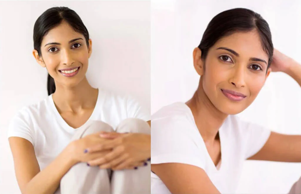
Matching skin tones in Photoshop might sound like an uncommon edit, and you may even wonder why you would ever need to do this. Well, it’s more common than you might think.
Take a close look at the two images below. It’s the same model in the same setting – but her skin tone looks completely different!
Skin tones can vary EVEN MORE when photographing a session that spans from typical daylight into the warmer, more diffuse lighting that occurs during golden hour.
You may also want to match skin tones WITHIN the same image, especially when the skin tone of your subject’s face and the body appear different. This can easily happen due to makeup, lighting, or color reflection from adjacent objects.
Whatever the reason, skin tone variation can easily be fixed in Photoshop using one of these three methods:
Method #1: Use the Match Color Tool
Using Photoshop’s Match Color feature is the easiest method. But it doesn’t work with all images.
For this method to work properly, the images need to be from the same set or photoshoot and generally have the same colors and characteristics.
If this is the case for you, open your target and reference images in Photoshop. Then, while you are in the tab of your target image, go to the top menu and select Image>Adjustments>Match Colorto open the Match Color dialog box.
When the dialog box opens, you will see an option to open the Source menu, where you can select your reference image. This is located towards the bottom of the dialog box (see image below). Make sure “Preview” is enabled so you can see how the adjustment looks before you actually apply it to your target image.
Keep in mind that you can fine-tune this adjustment using the sliders, but Photoshop’s Match Color usually does an excellent job on its own.
Once you’re happy with the results, click OK. That’s how easy it is!
Remember that the automated Match Color tool doesn’t work perfectly in every instance, especially under more challenging conditions. So if you are not achieving the desired results, try using the next method detailed below.
Method #2: Match Tones Manually
Matching skin tones manually is the second method to try. This will require you to see what color adjustments need to be made to more closely match the skin tones, and if you are a new photographer, this may be difficult for you. But the more you look at images and learn about color and white balance, the better you will become at this.
I recommend opening both images in the same document so you can compare them as you edit. To do this, simply open the reference photo and use the move tool to drag and drop it (the reference image) onto the image tab of the target image. Then resize the image as needed.
Alternatively, you can open each photo in its own tab and then use Photoshop’s Arrange feature to place them side by side. To do this, go to Window>Arrange>Tile All Vertically.
Start by matching the luminosity or brightness of the image. To do this, we will use a Curves Adjustment Layer. To add a Curves adjustment layer, go to Image>Adjustment>Curves.
In this example, the highlights were much brighter in the target image (right) than in the reference image (left) – so I started with adjusting the highlights by pulling down the upper-right corner of the curve. Then I continued to fine-tune the overall image by adjusting other areas of the curve.
Next, we will match the color using a Hue/Saturation Layer. To add a Hue/Saturation adjustment layer, go to Image>Adjustment>Hue/Saturation.
In the Properties Panel of the Hue/Saturation panel that opens, use the drop-down menu next to the hand icon to select any color you want to adjust. Once you choose a specific color to target, the eyedropper tool will be available to select a specific color range to target. If you leave the drop-down menu set to “Master,” the eyedropper won’t be available to select.
Once the eyedropper is enabled, grab the left-most dropper and click on the subject’s skin from the target image to sample the color. Notice how marks between the two color bars at the bottom of the Properties panel moved when you took the color sample. You can use these marks to fine-tune your color sample.
The two inner marks determine the color
The two outer marks determine how smooth the transition is.
Use the sliders to adjust the saturation or lightness of the color. You can even adjust the hue BUT move this slider very sparingly. If you are unsure how the sliders work, try making some extreme adjustments, so the changes are noticeable in the area you are targeting. Just remember to reset the slider back to 0 after you experiment and are ready to make real changes.
After completing this step, the skin tone on the target image should match the skin tone from the reference image.
On occasion, the background or other parts of the image can be affected by the adjustments. If this happens, use a layer mask to limit the affected areas. You can do this in the Curves Adjustment Layer AND the Hue/Saturation Adjustment Layer by highlighting the layer mask and simply painting with a black brush over the areas where you want the adjustments hidden.
That’s it! You’re done, and you can now discard the layer containing your reference image by dragging it to the trash can at the bottom of the layers panel.
The process of matching skin tones manually is quite simple but, as I mentioned previously, can take some getting used to as you train your eye to view and achieve a good color match between images quickly.
If you struggle to match skin tones using the manual method, move on to the third and final method described below.
Method 3: Adjust Output Values
In this third and final method, we will adjust output values in Photoshop to match skin tones.
Once again, I recommend opening your reference and target images in the same document for comparison purposes or opening each photo in its own tab and then using Photoshop’s Arrange feature to place them side by side.
Once your images are arranged, select an area of skin from the target image using the Rectangular marquee tool. Once you select an area, use the keyboard shortcut“Ctrl/Cmd + J” to copy the selection to its own separate layer. In this example, I selected an area from the subject’s forehead.
Next, highlight the layer you just created, and then go to the menu and select Filter>Blur>Blur. This will blend the pixels together, so when we use the color sampler in the next step, it will best represent the skin tone.
Repeat these same two steps on the reference image so that you will end up with a swatch of both skin tones—each on a separate layer.
Disable the visibility of both images and leave only the two color swatches active. You can quickly do this by clicking on the small eyeball to the left of each image layer.
Next, we will add a Curves adjustment layer (Image>Adjustment>Curves) and put it ON TOP of all the other layers. Don’t change anything for now. Just make sure this Curves layer is selected when you do the next step.
Open the Info Panel of the Curves layer. If you can’t see it, enable it by going to Windows>Panel.
Then, grab the Color Sampler Tool from the toolbox (it’s nested inside the eyedropper tool).
With the Color Sampler active, click on top of the color swatch from the reference image. Then, hold down the “Alt” key (on PC) or “Option” key (on Mac) and click on the color swatch from the target image. Each click will create a sample in the Info Panel that shows the input and output values of the clicked pixel.
You should now have the RGB values from sample number one (the reference skin tone) and sample number two (the target skin tone).
Adobe Lightroom is a brilliant and intuitive software program, and once you begin adding keywords to your images there, it will start learning what type of words you regularly add to your photos. In addition, It will also recognize specific kinds of images and populate keywords within the Keyword Suggestion area of the Keywording Panel based on the type of image it is.
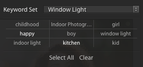
How to Create a Keyword Set
Creating a Keyword Set is simple, following the steps below:
Next, in the Keyword Set area of the Keywording Panel, choose “Recent Keywords” from the dropdown menu. This should immediately populate the nine keywords you just typed in.
Finally, choose “Save Current Settings as New Preset” from the same dropdown menu and give it a name. Click “Create” when finished.
You should now have a new option in your Keyword Set dropdown menu to choose from.
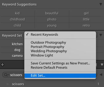
How to Edit a Keyword Set
This comes in handy if you want to edit one of the default Keyword Sets created by Adobe or edit a keyword set you have already created:
First, choose a Keyword Set from the Keyword Set dropdown menu.
Next, choose “Edit set” from the same dropdown menu. This will open up a box with the name of the Keyword Set and nine small boxes with words in them.
From here, you can change the name of the Keyword Set or any of the keywords in that set. Remember, the maximum number of words you can have in a Keyword Set is nine.
Adding Keywords to Multiple Photos
Just like you can sync edits in Lightroom, you can also sync keywords to OTHER PHOTOS in Lightroom:
In the Library Module, add keywords to the first image in the set you would like to sync.
Then hold down the “Shift” key and click on the last image in the set that you would like to sync. You will see the “Sync Metadata” button appear on the right side of the Library Module – click it.
Since I just want to sync the keywords, I only check the Keywords box and then press “Synchronize.” Your keywords will then be synced to all of the selected photos you selected.
Another way to quickly add keywords to multiple photos is to use the Painter Tool – which I will discuss next.
Adding Keywords in Lightroom Using the Painter Tool
The Painter Tool is another fun way to add keywords to one or multiple photos in Lightroom:
In the Grid view, click the Painter tool icon in the toolbar. If the Painter Tool is not in the toolbar, you can choose to have the Painter Tool appear in the Toolbar Menu at the far right of the toolbar.
When the Painter tool is enabled, the pointer becomes a painter icon, and the Painter icon is no longer visible in the toolbar. If necessary, choose Keywords from the Paint menu in the toolbar. It is possible to use the Painter Tool to paint other characteristics besides keywords so just make sure that the keywords option is selected.
Type the keyword or keywords you want to add or remove in the toolbar field.
How to Apply Keywords With the Painter Tool:
To apply keywords to a single photo, click the image using the Painter tool.
To apply keywords to multiple photos, click and drag across the photos in the Grid View.
To remove added keywords, press “Alt” (Windows) or “Option” (Mac OS) to change the Painter Tool to an eraser. Click the photo again, or click and drag across multiple images with the eraser.
To disable the Painter, click the circular well in the toolbar. When disabled, the Painter icon will again be visible in the toolbar.
Using Keyword Sets and the Painter Tool Together
You can also quickly assign keywords using the Painter Tool and Keyword Sets together.
In the Library module, select one or more photos. “Ctrl/Cmd + click” to select multiple photos. Then, click the Painter Tool and press the “Shift” key. A keyword assignment dialog box is displayed. Select a keyword set from the pop-up menu.
Select one or more keywords from the keyword set. Choose “Select All” if all the words apply. If needed, you can choose a different Keyword Set and add additional keywords from that set.
Hover the Painter tool pointer over the selected photos and click them. The keywords you chose will be assigned to those images. You can also assign the keywords to multiple photos by clicking and dragging across multiple images.
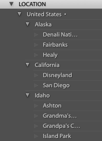
Creating Lightroom Keyword Hierarchies
Creating keyword hierarchies is a way to organize your keywords and simultaneously add multiple keywords (keywords within keywords) to your photo. This is an advanced way to use keywords.
Basically, this involves placing keywords within keywords. Then, when the lowest keyword in the hierarchy is added to an image, the other keywords above it are also added.
An instance of when you would want to use keyword hierarchies is when you have images that would benefit from multiple location keywords. For example, if you took a photo in San Diego, you may want to add “San Diego” as a keyword. But you could also create a keyword hierarchy, like United States>California>San Diego (you could go even further). Then when you add San Diego as a keyword, all of those other words that apply to your image will also be added automatically.
NOTE: If you look in the keyword panel to check this, by default, you will only see San Diego. That doesn’t mean other words haven’t been added; they are just not visible.
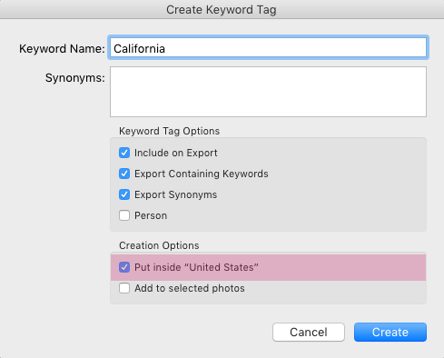
You can create a keyword hierarchy by creating a new keyword under which you want other keywords to be included. For example, I created a new keyword, “Location.” I created this new keyword by finding the Keyword List panel in the Library Module (located on the right-hand side). Clicking the “+” will open a dialog box to help you create a new Keyword.
With that keyword highlighted, click on the “+” again and add the keyword “United States.” It will give you the option to put this keyword inside the keyword you have highlighted. Then you can highlight “United States” and click the “+” again to add all the places within the United States you desire to add. You can always add to this over time.
I previously mentioned that Lightroom keyword hierarchies are a more advanced keywording technique. This is not because they are hard. But, this technique does require some additional time to set up – something only more advanced users who depend heavily on finding images with keywords or are using keywords to help others locate their photos online
proportional relationship between an image’s width and height — profoundly shape visual storytelling, technical workflows, and print outcomes. This guide explores their role in photography, compares common formats, and provides actionable strategies for adjustments in-camera or through post-processing.
What is Aspect Ratio?
Aspect ratio is the term used to describe an image’s dimensions (width and height) shown in ratio form. Initially, the aspect ratio of an image is determined by the camera’s sensor.
Most DSLR camera sensors have a 3:2 aspect ratio, the same aspect ratio as 35mm film, which has become the industry standard. Micro four-thirds cameras have sensors with a 4:3 aspect ratio, which is between the standard 3:2 and the 5:4 ratio of an 8×10 print. Some newer digital cameras also include a feature that will let you change the aspect ratio in-camera.
Comparing Aspect Ratios
While most cameras shoot in the 3:2 aspect ratio, the ratio we see most commonly in a printed photo is 5:4 which was made popular by old portrait photographers that shot with 4×5 film. They made standard printing sizes such as 4″x5″, 8″x10″, 16″x20″, and 11″x14″ popular as these sizes required little to no cropping. These are the SAME SIZES you will find in standard frames sold in retail stores.
Importantly, when you compare the 3:2 aspect ratio of the image taken with a digital camera to the 5:4 aspect ratio of a standard photo print, you will find they are very different. You can see below that for a 3:2 image to fit in the 5:4 aspect ratio that is printed, a significant portion of the 3:2 image WILL BE LOST due to cropping.
How Aspect Ratio Affects Composition
To compose better images, it is essential to understand how aspect ratio can affect your composition.
For example, it’s possible to have a beautifully composed photo properly utilizing the rule of thirds at a 3:2 aspect ratio, but if you don’t plan ahead, the image may not look as lovely once printed at a 5:4 aspect ratio. Even worse, you could end up with a printed photo where the subject’s hand, foot, or head is cut off. Trust me; it can happen!
Here are some examples: The two images below show how each image shot at a 3:2 aspect would look when cropped to a 5:4 aspect ratio.
Notice that in this image, there is not quite enough space around it for a good crop.
Adjusting Your Aspect Ratio In-Camera
There are two ways to adjust the aspect ratio: in-camera and cropping during post-process. First, let’s talk about changing the aspect ratio in-camera.
Some digital cameras allow you to adjust your aspect ratio in-camera (mostly Canon and Sony). Most commonly, they will have aspect ratio options for 3:2, 4:3, 16:9, and 1:1. Selecting your aspect ratio in-camera is a good choice if you don’t plan to post-process your images and want to have the image size already set for printing or sharing.
I recommend choosing 16:9 when shooting video or 1:1 (a square ratio) for sharing on Instagram. None of the aspect ratios listed above fit the 5:4 aspect ratio of the popular printing sizes.
For anyone who will be processing images in Lightroom or Photoshop, I strongly suggest you leave your camera set to its original aspect ratio and make any adjustments by cropping during your editing process.
Keep in mind that you will need to be aware of your framing in-camera, so there will be enough space around your subjects to allow for cropping as needed.
The best way to do this is to compose your shot in-camera and then physically take a step back OR reduce your focal length to include a bit more in your shot. This will give you significantly more options when cropping in Lightroom or Photoshop.
Aspect Ratio and Cropping in Lightroom
I generally crop and export my files in the original ratio that my camera captures (the same as how the scene was viewed and framed in-camera).
Once the images are imported into Lightroom or Photoshop, they can easily be cropped using several different aspect ratios as needed. Remember that all cropping aspect ratios are NOT the same, and you will need to ensure that there is enough room in your image so that it can be cropped to the aspect ratio you want.
Consider this example: In the photo below, notice how much of it will be lost when cropped in Lightroom to an 8×10. In fact, a large portion of the flowers that were beautifully framing the subject will be lost when cropped, changing the finished image drastically.
Educating Clients About Aspect Ratio
When possible, I discuss and recommend print sizes to my clients that fit the SAME aspect ratio my camera shoots in: 4×6, 8×12, 12×18, 16×24, etc.
Most clients have no idea that a camera shoots in a different aspect ratio than popular print sizes (4×5, 8×10, 11×14, 16×20, etc.). But, if they insist on print sizes that are different from the ratio my camera shoots, I explain that I will have to do some cropping to fit their desired ratio/print size.
Many professional photo printers use ROES (Remote Order Entry System) which allows you to upload your images and then adjust the crop until you like what you see. Other printers offer online ordering with a similar ability to change the crop. Hopefully, you have left enough room around your subject to allow for any crop your client may want.
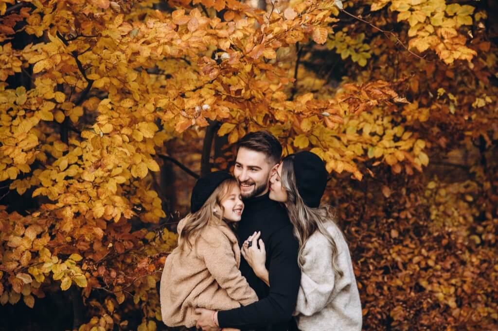
photographing a family’s story carries immense responsibility—your images must encapsulate the bonds of love and connection that define them. Below are seven foundational poses, refined through professional experience, to help you create timeless, emotionally resonant portraits that families will cherish.
Top 7 Family Photography Poses
1. Family Together
I generally find it easiest to start with the whole family group. The family you are photographing will be expecting this shot, and the children usually have the most patience and stamina at the beginning of their family photo shoot.
If the family has small children, set up a tried and true family pose (sitting or standing) and try to get a few shots of all of them looking, and then let them interact and play together so you can take some candid photos.
If the family has older kids, set up 2-3 family poses and then add in an alternate location. The kids will have much more stamina for multiple settings. However, always try a few candid shots, even with families with older kids.
2. Children Together
Since you still have the children’s attention, remove the adults from the photo and encourage them to interact. A simple hug or look between the children can create closeness and/or laughter that is a joy to photograph. Make sure you are ready to shoot many frames if the children are little.
If the children are older, you can do multiple poses or locations (not both—even older kids have their limits).
3. Mom with Children
Before the children leave, have Mom join in for some fun. Typically, these shots can be more candid and free.
Have Mom give kisses to the kids or have the kids kiss Mom. Even just looking at each other is a beautiful option. Older kids probably won’t be up for all the kissing, etc., but don’t leave this shot off the list – ALL kids need a photo with their mom, and ALL Moms need a photo with their kids!
4. Dad with Children
After taking several photos with Mom and the kids, have her switch out with Dad for several more shots to keep the fun, candid feeling.
If needed, you can place shorter children on a step or crate to help get them closer to Dad. If there is only one child, have Dad pick them up and have fun with them.
5. Mom and Dad Together
I think that every family shoot should capture the vital couple relationship that created the beautiful family in front of your lens. Couples often neglect to photograph themselves together, and they will cherish a good portrait of them together!
I don’t get overly creative with these, but a posed image of the couple looking at the camera and a more candid shot of the couple looking at each other or with eyes closed are good options and all that is needed.
6. Each Child Individually
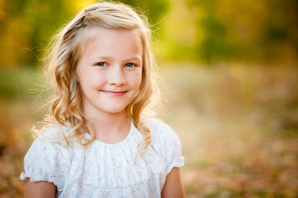
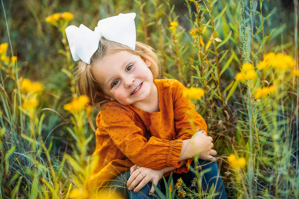
Take time to capture each child individually. Often, I will move these shots a short distance from where we had been shooting to ensure I have each child’s full attention.
I definitely try to have a sitting pose, a standing pose, and one good close-up. Try to stay on the same level as your subject, especially if they are little!
7. Dad & Son(s) and/or Mom & Daughter(s)
If the family group is such that this pose lends itself to them, I will try to capture these shots. For instance, a mom with her three daughters or a dad with his two sons are both sweet shots the family will cherish.
These groupings work well with candid-style poses and lots of laughing and playing. Encourage interaction, joke telling, and bathroom humor. These should be fun and the “icing on the cake” of your session.
I consider these groupings optional, so before proceeding with these optional poses, it’s a good idea to gauge whether the family still has the patience left for more photos.